The center of the Monitor page gives a visual
representation of the state of your servers.
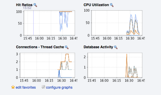
The graphs present information about the currently selected server or server group. The default graphs show the hit ratios, CPU utilization, connections, and database activity for a specific interval.
Graphs also provide an entry point for examining the operations on a server in relation to the queries that were being on the server at the time. The plots of the graph are correlated with the queries that are being executed at that time, enabling you to monitor your server usage more effectively. By clicking and dragging on a graph you can zoom in on the graph content and then view the queries that were being executed during the specified period in order to gain a better insight into the operation of your servers. This information is only available if you have configured query analysis, and have enabled query analysis for the servers you are monitoring. For more information, see Chapter 9, The Query Analyzer Page.
To set the interval click the configure graphs
link immediately below the graphs. This opens a dialog box where
you can choose the default interval for the x-axis of the graphs.
Defining a shorter or longer interval gives you a shorter or
longer term view of server activity. The thumbnail and full-size
graph dimensions can also be adjusted from this dialog box. Save
any changes that you have made and the values chosen will be the
defaults whenever you log in.
You can also choose the default graphs shown on the
Monitor page. To do this click the
edit favorites link and choose the graphs you
want from the drop-down list box. To choose contiguous graphs,
hold down the Shift key and click on the desired
graphs. For a noncontiguous selection, click the desired graphs
while holding down the Ctrl key. The maximum
number of graphs that can be displayed on the
Monitor page is six. Save your changes and
these will be the default graphs whenever you log in.
Color coding helps distinguish different aspects of each graph.
With Database Activity for example, you can
readily distinguish SELECT statements from
database insertions.
Clicking a graph opens a detailed view with Graph
Display and Configure tabs. Choose
the Configure tab to temporarily change the way
that a graph displays. Changes made from this tab only apply to
the standalone graph while it is open. Persistent changes are made
as described above.
Dismiss the enlarged graph by clicking the button.
Alerts from the event system will be displayed immediately below the charts. For more information on the events display, see Chapter 7, The Events Page.